• India

  • USA

  • UAE

  • Spain

  • Australia

  • UK

Who Is CtrlS?

CtrlS, a dominant force in the data center industry, stands out as Asia’s largest Rated-4 data center company. Its exceptional ability to cater to the comprehensive and demanding data center requirements of the largest businesses, irrespective of their size, scope, or scale, is a testament to its triumph.

With global ambitions, the company is ramping up its operational capacity, focusing on green data center design, best-in-class service delivery, and a firm commitment to helping clients achieve their digital transformation goals.

The company also offers colocation and managed services that enable clients to optimize costs and strengthen business continuity.

CtrlS has earned its stripes as a go-to data center company. Still, it wanted to ensure that it is known not only as a company offering vanilla data center services but scalable, top-of-the-line, customer-focused, and future-ready data center solutions and services.

Its brand, therefore, had to be future-ready and future-proof as well!

The Trigger

Siddharth Singh is the Senior Vice President (SVP) & Chief Marketing Officer (CMO) at CtrlS. One of his tasks is to ready the brand for the future and ensure CtrlS is not seen as a legacy brand but a brand that understands the data center needs of the future and is building solutions that its clientele can leverage to address not just current data challenges but those of the future as well.

While conducting a marketing audit, he realized a pressing problem that needed to be corrected if CtrlS was to reinforce its brand identity with a unified voice across marketing channels across locations. Its branding had to resonate with its brand attributes visually and textually and be consistent across every brand collateral distributed internally and externally.

However, this could only be achieved if the proper brand standards and system existed.

Priority #1: Modernize brand by introducing a new visual identity system

Priority #2: Define brand manual and create comprehensive brand library

Priority #3: Craft adaptable brand templates for seamless implementation across all touchpoints

Why Helveticans for Brand Refresh?

Helveticans has established itself through creative excellence and an exceptionally personalized approach to rebranding. Our methodology prioritizes a brand's intrinsic requirements while adeptly navigating both clearly defined and ambiguous parameters, aligning perfectly with CtrlS' complex rebranding needs.

Siddharth and his team were seeking a long-term creative partner capable of addressing all their marketing needs. They required an agency that could develop, establish, and maintain clear branding protocols. These protocols needed to:

  • Facilitate brand modernization
  • Ensure consistency across all touchpoints
  • Enhance brand relevance and differentiation
  • Improve customer appeal
  • Maintain internal alignment

He hired us after talking to us, seeing our work, trusting our branding instincts, and being convinced that we have what it takes.

Got an idea around "Brand Refresh"? Let’s brainstorm together!

Reach out to Jayan, our CCO
The Ask

In the pursuit of modernizing the CtrlS brand, Helveticans was entrusted with a comprehensive brand evolution initiative. Our mandate encompassed four critical components:

  • Crafting a New Visual Language System: We were tasked with developing a fresh, cohesive visual framework that would elevate CtrlS's brand expression while maintaining its core identity.
  • Designing Application Master Templates: Our team was charged with creating versatile, standardized templates to ensure consistent brand application across all touchpoints.
  • Refreshing the Brand Voice: We were asked to refine CtrlS's tone of language, aligning it with the company's evolving market position and target audience expectations.
  • Developing an Extensive Brand Manual: Our ultimate deliverable was a comprehensive brand guide, meticulously detailing all elements of CtrlS' revitalized brand identity.

This multifaceted approach was strategically designed to not only address CtrlS's current brand needs but also to future-proof their visual and verbal identity. Our goal was to create a highly evolved brand ecosystem that would resonate in the present marketplace while possessing the flexibility and foresight to remain relevant in the years to come.

Crucially, our challenge was to uncover a new visual language that remained true to CtrlS's existing brand ethos while aligning with their future roadmap. This ensured that every promotional endeavor, regardless of medium or platform, would speak to the audience with a unified, consistent voice – a voice that honors CtrlS's heritage while boldly stepping into the future.

This final addition ties the entire piece together, emphasizing the delicate balance between honoring the existing brand and pushing it forward, which is often a key challenge in rebranding projects.

Guardrails – Do’s and Absolute Don’ts

The key focus area was fleshing out the brand so that its identity is concretized, consistent, and standardized across the board. The clear no-go area was rebranding the logo and moving away from the primary color palette. We realized that key decision-makers and stakeholders were so emotionally invested in the existing brand, whose credibility and reputation they had built with so much care and effort, that they would resist if the refresh meant extensive rebranding, wherein the critical branding elements took the brand in a new direction. The visual harmony had to be built on the existing foundation yet was flexible enough to offer new avenues of creative expression.

The overall brand had to look the same, but different!

The Challenge

The process of rebranding is a massive challenge in itself. A creative agency must understand the core purpose behind the rebrand, the emotional connection that needs to be achieved, and the tangible and intangible goals. Then, they must create a visual framework composed of crucial branding elements that combine seamlessly to build a new identity.

But things get even more difficult in a brand refresh with unshakable guardrails.

CtrlS’ Well-Established Roots in the Customer Psyche

Clients knew what CtrlS stood for, refresh or no refresh. The core objective was refreshing the brand with a global outlook that did not veer too far from the existing visual schema yet looked fresh, polished, and sophisticated enough to cater to the client of the future, with certain specific expectations from the brand.

Navigating the Marketing Committee's Vision

A key challenge was aligning our rebranding efforts with the Marketing Committee's vision. They endorsed the refresh but emphasized preserving CtrlS's core identity. We guided this influential group through a detailed process, balancing innovation with heritage. Our meticulous approach ensured thorough scrutiny and approval of every rebranding facet.

Cross-Platform Consistency

A significant challenge was ensuring CtrlS's refreshed brand identity and maintained consistency across all platforms. As a data center leader, their brand touches numerous digital and physical touchpoints. We faced the complex task of creating a visual language that would translate seamlessly from web interfaces to corporate literature, maintaining brand integrity across diverse mediums.

Future-Proofing

In the rapidly evolving tech landscape, we grappled with the challenge of future-proofing CtrlS's brand. Our team had to anticipate how the new visual language system would remain relevant in the age of GenAI and beyond. This required us to develop flexible design systems and consider modular design elements that can easily evolve with emerging trends, safeguarding CtrlS's brand identity against obsolescence while maintaining its essence.

Customer Perception Shift

As Asia's largest data center company, shifting CtrlS's customer perception presented a delicate challenge. We needed to modernize the brand image to reflect its innovative capabilities, while carefully preserving the trust and reliability that customers associate with CtrlS. Balancing this evolution with the retention of core brand values was a complex undertaking.

Employee Buy-In

Another challenge was ensuring internal alignment with the refreshed brand. Siddharth, as a visionary leader, played a pivotal role in articulating the rebranding vision and execution strategy both internally and externally. Our task involved supporting his efforts by closely collaborating with key marketing and PR team members, integrating their insights, and fostering a sense of ownership. This approach was crucial for authentic brand representation and smooth implementation across the organization.

A Comprehensive Brand Manual from Scratch

The only reference point for making a beginning was the existing logo and color scheme. We had to identify the length and breadth of the elements that would be a part of its brand identity that would result in a brand upgrade without conflict with the existing and established visual philosophy of CtrlS.

How We Did It?

Brand Audit and Discovery

Our journey began with an extensive brand audit, meticulously examining CtrlS's existing brand assets and their evolution over time. We engaged in in-depth conversations with key team members to uncover pain points, current practices, and the brand's historical development. This comprehensive discovery phase allowed us to identify inconsistencies, strengths, and areas for improvement within the brand ecosystem. By understanding the nuances of CtrlS's brand journey, we were able to pinpoint exactly where the refresh needed to focus, ensuring that our approach would address real challenges while preserving the core elements that had contributed to CtrlS's success. This foundational work set the stage for a strategic and targeted brand evolution.

Stakeholder Interviews and Periodic Briefing Sessions

Our process was deeply collaborative, beginning with a comprehensive briefing from the CtrlS team. We then conducted multiple rounds of individual and team meetings, each session peeling back layers of insight into the brand's essence. These interactions were crucial in understanding the vision and values held by key decision-makers and employees alike. Parallel to these discussions, we collected and analyzed a wide array of existing marketing assets, providing us with a tangible history of the brand's visual journey.

Brand Strategy Development

Our approach to CtrlS's brand strategy development was comprehensive and nuanced. We began by defining the brand's positioning, carefully considering CtrlS's current market leadership and its ambitions for the future. This process involved a deep dive into the brand's personality, distilling its unique attributes to craft core messaging that would resonate with both existing and potential clients. We refined CtrlS's elevator pitch, ensuring it succinctly communicated the brand's value proposition and market differentiation.

Simultaneously, we developed a robust brand architecture that clearly defined the relationship between CtrlS's various services and sub-brands, creating a cohesive structure that could accommodate future growth and expansion. This strategic foundation served as the north star for all subsequent creative and communication efforts, ensuring a unified and powerful brand presence.

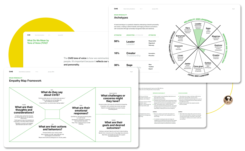
Defining Brand Essence and Brand Personality

We identified the core principles that defined CtrlS and what they hoped to achieve with their data center solutions and services portfolio. We leveraged an empathy map to recognize brand attributes that could be considered the driving force of our ‘stylescape’ and visual decision-making.

However, identifying attributes was just one part of the process. The problematic part was assigning weightage to the characteristics to create a comprehensive ‘mind map’ that provided meaningful guidance on the creative process and set a firm foundation for a cohesive visual representation of the brand.

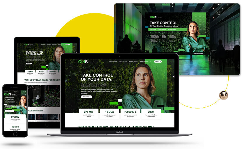
Creating Visual Identity System Based for New Brand Archetype & Positioning

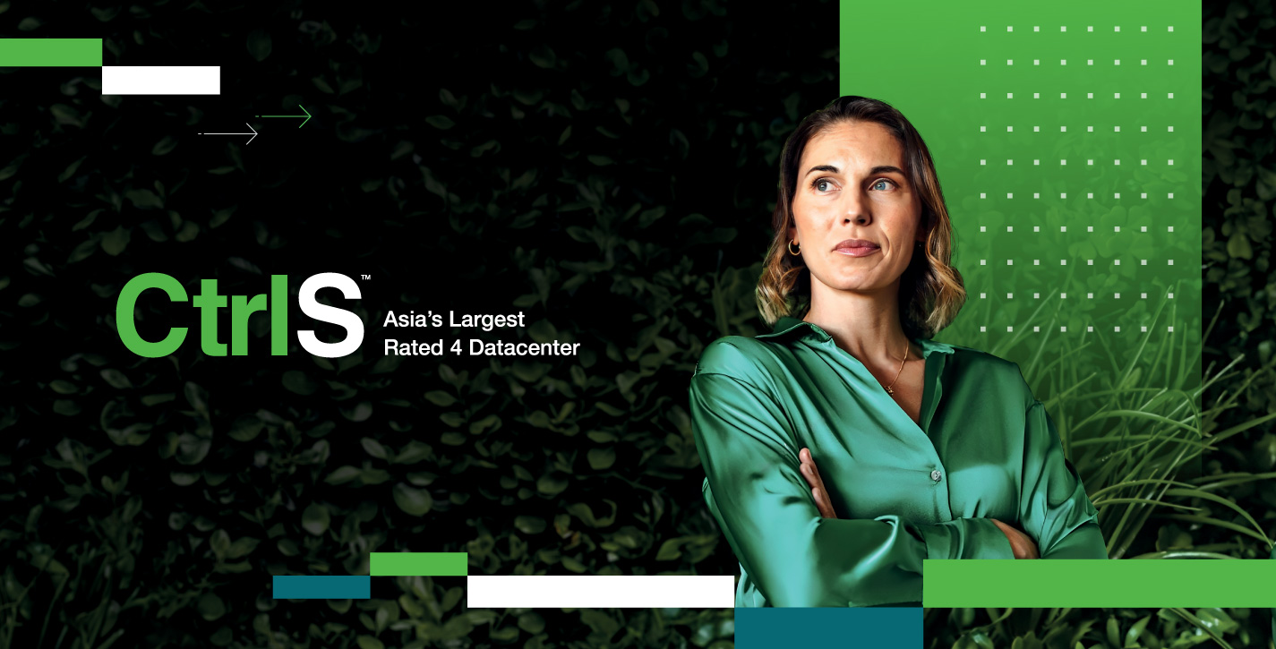
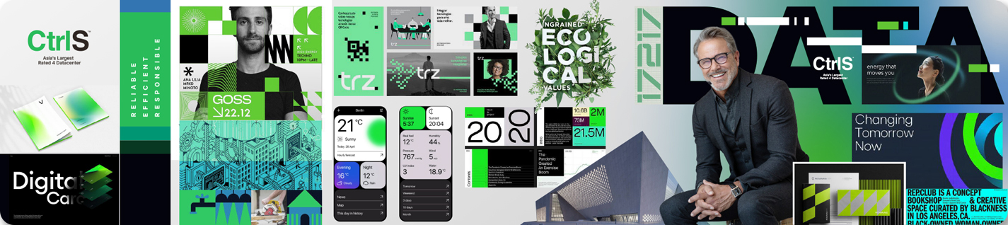
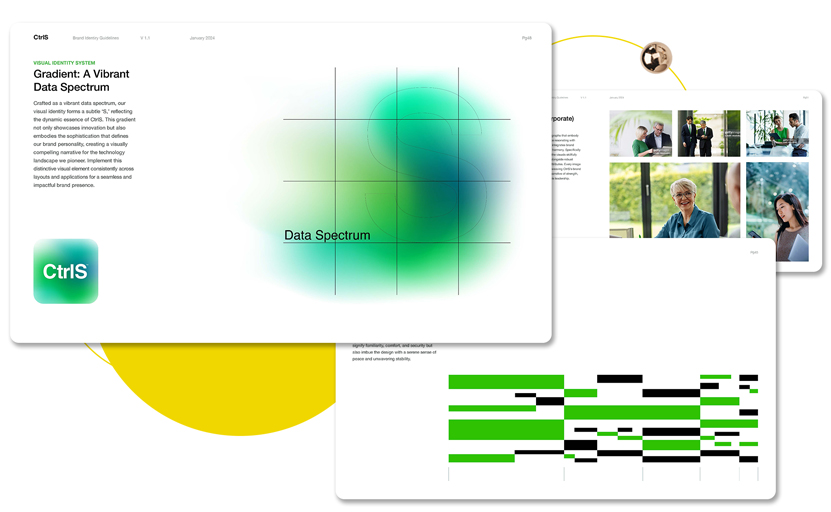
Photography brings a relatable and personal element to the brand and reflects its archetype. The brand guidelines include using proper photography that integrates brand colors and wherein the photographs are in deep synergy with the audience's expectations—empathetic photography.

Salient features

  • Open spacing and minimalist looks inspire confidence
  • Rounded shapes and lowercase humanize and make it more engaging
  • Refined curvature indicates innovation and a progressive attitude
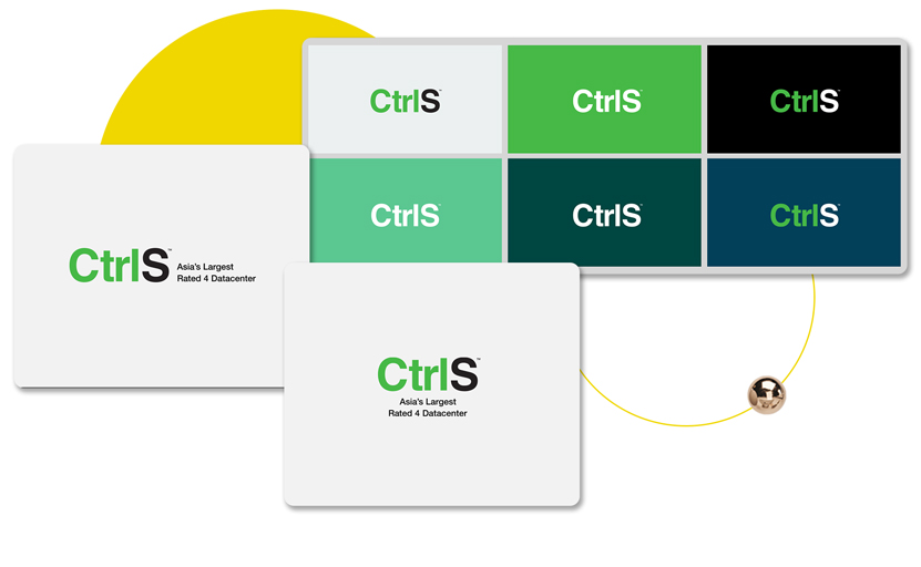
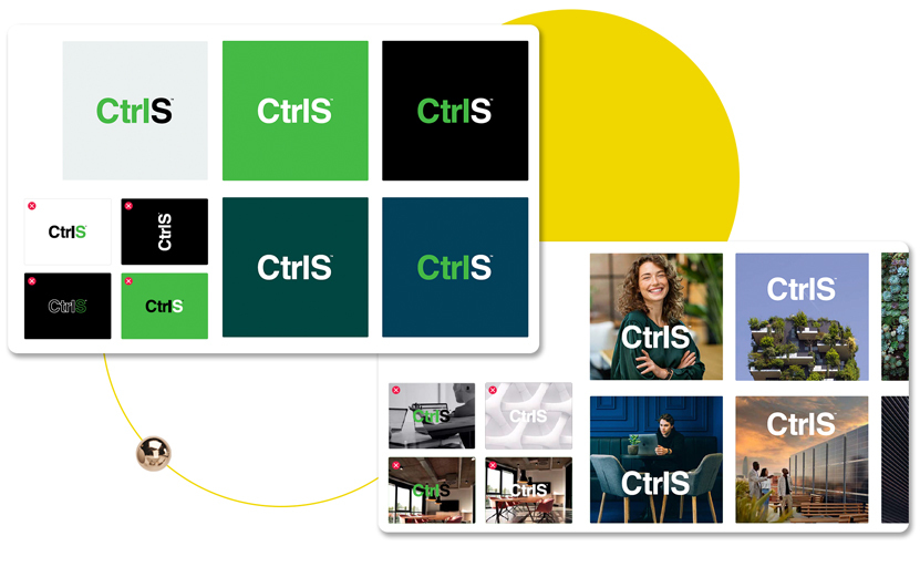
The Logo Color

We fine tuned the logo color, with the primary logo applied to a white background and a white logo applied to dark backgrounds. Such placement made the logo more legible and helped it stand out from other page elements, thus reinforcing the CtrlS brand identity.

The Color Palette

The focus of attention was a distinct color palette comprising both primary and secondary colors, clearly defining their specific usage. Pantone colors were considered ideal for all print applications, while saturated colors can highlight the UI and infuse more meaning into the layout. We also provided concrete guidance on using color to highlight the brand better, mainly how brand colors can be reflected in the images used.

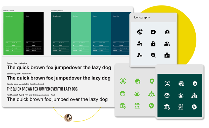
Typography and Visual Patterns

Helveticans mapped brand attributes against the right fonts and chose primary and secondary fonts that exuded understated sophistication. The focus was on leveraging fonts that offered usage flexibility across all brand communications and looked professional. Another area of guidance was working out a typographic hierarchy for font usage in ‘Headlines, ‘Sub Headlines,’ and ‘Body Copy.’

Illustration and Iconography that Drive Forward-Looking Narratives

Using suitable illustrations can make or break content. Still, every illustration leveraged by CtrlS has to be distinct from one another, relatable to the brand identity, and have a commonality that drives brand recall.

When it comes to icons, CtrlS icons are unique and purposefully created to represent the brand’s adherence to a simple yet impactful visual language corresponding to its innate values. A perfect confluence of illustrations and icons delivers a meaningful narrative.

Managing the Layered Feedback Process

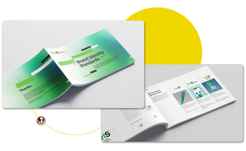
We created a brand refresh document that covered all brand elements and highlighted their needs comprehensively. We also made a ‘Stylescape’ document that fleshed out every aspect of the brand element and showed how they contribute to building a brand identity. The development of each component was time bound and up for discussion at all times, with a cut-off date.

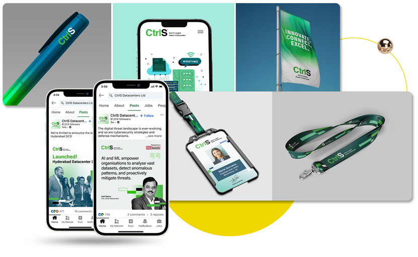
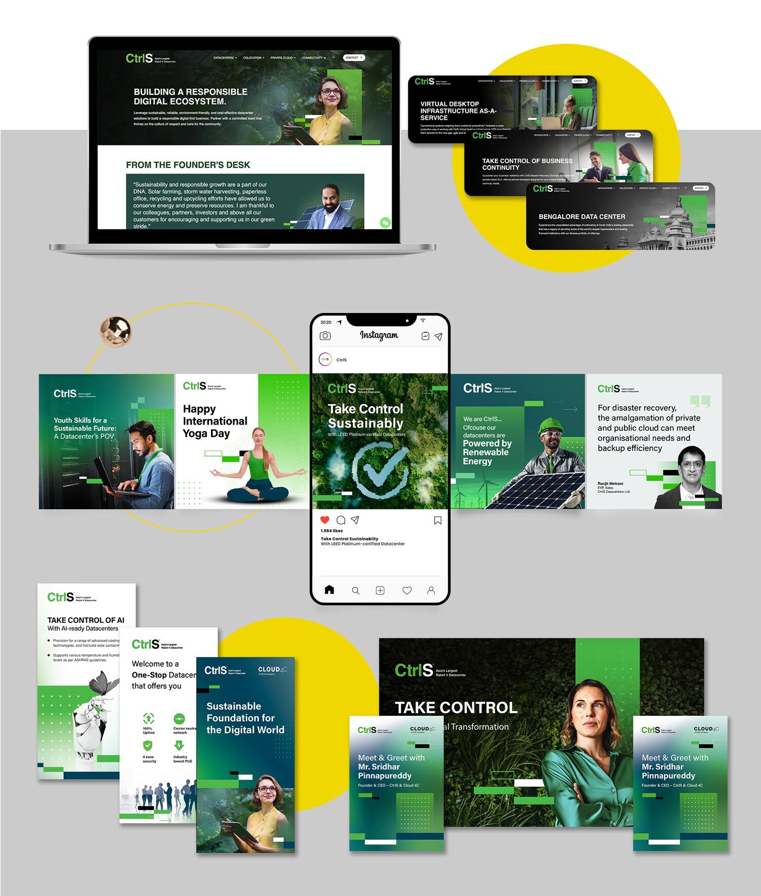
Creating Collaterals

When enough brand elements were green-lit and we had a cohesive visual identity system, we began work on CtrlS collaterals, incorporating the new brand guidelines. The work on the brand guidelines document kept happening in the background, and as new elements were defined and agreed upon, they flowed seamlessly into the collaterals.

Results

The brand refresh for CtrlS yielded transformative outcomes that perfectly encapsulated the company's positioning, values, principles, and attributes Our strategic approach resulted in:

  • Comprehensive Brand Guidelines: We delivered an extensive, user-friendly manual that serves as the definitive guide for CtrlS's brand identity. This document ensures consistency across all touchpoints while providing clear direction for brand application.
  • Extensive Library of Brand Elements: We created a rich repository of visual assets, including refined logos, a versatile color palette, custom iconography, and signature patterns. This library empowers CtrlS to maintain brand coherence across diverse applications.
  • Repository of Application Templates: We developed a wide array of templates for various marketing materials, digital platforms, and corporate communications. These templates, along with their variations, enable efficient and consistent brand implementation across all channels.
  • Evolving Visual Language: Our work laid the foundation for a dynamic visual identity system. We provided a clear vision for how this system can evolve in the near future, along with guidelines for fine-tuning the visual identity as the brand grows.

The refreshed CtrlS brand now embodies a perfect balance of established trust and forward-thinking innovation. Its inherent flexibility allows for seamless integrations and incremental changes, empowering the marketing team to adapt the brand as needed while maintaining its core essence.

KRAFTON INDIA

Wipro Podcast

Learn how we can help you create new growth!

LETS TALK